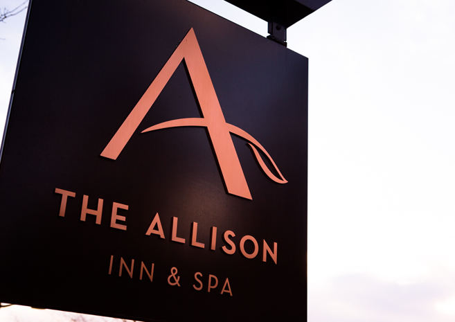
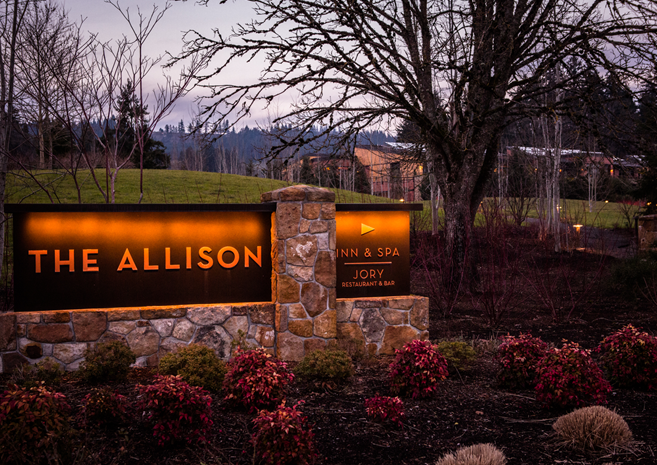
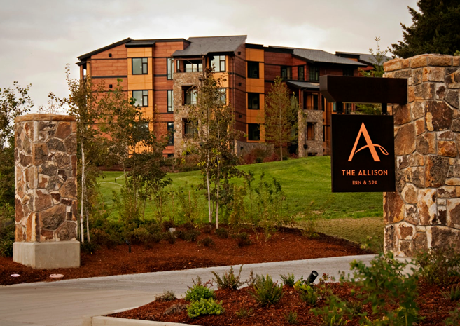
The Allison Inn and Spa
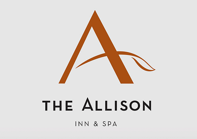
The Allison Inn and Spa logo was designed by Wes in conjunction with a larger brand strategy by Leo Ketel. The primary purpose of the logo was to convey luxurious accomodations in Oregon's celebrated wine country. The secondary purpose was to timelessly carry the message of the land upon which it was built. Lake Allison was a giant lake (formed by a massive glacial flow) which carried mineral rich silt and over time lead to the Jory soil that covers the Dundee Hills (where the Allison Inn is located). The large "A" letterform stands for The Allison Hotel, but is also symbolic of the lake from which soil and vegetation sprang forth. The viewer is not expected to decode all the symbology behind the logo, however all the symbols working together reflect the feeling of bounty and natural abundance.